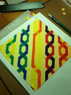
For the next project we were assigned the task of creating a 7" x 7" design that we would recreate with the 4.5" x 6" Color-Aid cards to show a focus on pattern, dimension, light or transparency (or a combination of the 4).
I pondered options and drew some sketches of my ideas:
(Click on the pictures to enlarge if you're curious.
Again...apologies for the light drawings - which make for poor photographs.)

Above left - #1 Sun/heat & Monsoon/water.
Above right: #2 A window with curtain blowing in breeze.

Above left - #3 Quilt inspired Window Pane with Cat.
Above right - #4 Stylized Sun/Wind/Mountain Range.

Above left - #5 Quilt inspired Log Cabin/Pinwheel
Above right - #6 Quilt inspired Celtic Chain
I reviewed my ideas with the teacher and although we both found #1 (Sun & Water) & # 4 (Mtn. Range) intriguing, #6 was also favored. And I chose to go with #6 - which was based on a pattern in "Celtic Pieced Illusions" by Karen Combs. {A truly spiffy and clever book!}
My focus was going to be Transparency and I pulled several ranges of colors from the remaining cards in my Color-Aid. Then I started trying to pull cards that would support the color transitions/transparency as the Celtic chain/cables crossed each other.
It was challenging to find a range of colors that would work. The closest I got was with a "rainbow" in bright primary colors. I shifted my palate some to find good transparency matches - and the teacher approved my choices.
{whew}
She assisted me in choosing background colors and I set to work.
{Foreshadowing...we didn't consider the background color effect with ALL the chain colors.}
 |
| Yep, I went through several xacto knife blades on this project. |
{More Foreshadowing...this did not allow me to transition background colors as well as I could have.} {sigh}
There was a great deal of fussy-cutting and I credit my sanity to listening to the CraftLit podcast whilst I cut and re-cut many, many small pieces of paper out of the templates and then reversed those pieces to cut from the back of the Color-Aid cards.
I decided pretty early on that fussy-cutting fabric for a quilt was easier than this Color-Aid project.
I had already learned that it is a bad idea to cut bits of Color-aid with a dull Xacto blade. {sigh}
The 1st pass of cuttings were pasted down with temporary glue.
 |
| The flaws with the background color is evident in this picture. |
 |
| {I was getting really tired of glue about this time.} |
 |
| {The yellow & backgrounds don't look too bad in this lighting.} |
As foreshadowed above, the review in class brought to light that the background colors washed out/made the yellow cables invisible and that the background color transitions would have worked better if I'd cut all the individual squares/triangles instead of going with the larger pieces.
And...because it was the background {and permanent glue}, it wasn't something I could easily fix.
{sigh}
However, the teacher said I did an excellent job of cutting/placing all the pieces and I did represent transparency very well in the over/under crosses of the cables and the colors I chose.
And yes, this project was a neatly-planned stepping stone {training} for the final Color and Composition project - in Triplicate.


First: I HAVE to see this in person. Have to.
ReplyDeleteSecond: I swear your drawing skills have done a great leap forward. Or maybe it's just moi. Though I must confess, great leaps are not happening for me just now.
These colors and the composition puts me back in Mrs. Seeman's kitchen. She lived down the street from me when I was four, in 1951. She had wonderful colors and decor in her kitchen, very much in the style of the time. Lush colors, but not too bright, friendly, fun and relaxing. Sun-washed. She loved kids and let us play on her sun porch, and gave us potato chips, which I had never seen but they seemed the height of hospitable luxury. She had wall plaques of flirtatious fruits and vegetables, and a set of dishes reminiscent of this design.
ReplyDelete