Portfolio Pages

Sunday, August 25, 2013

Surface Design Play Day, Fiber-esque Videos & The Corn Mothers

Continuing the belated Spring 2013 Fiber Arts Degree posts:

Surface Design Play Day:
We had a "play" day in Mixed media where we explored a little bit of Surface Design on a yard of Pellon Interfacing (non-fusible). ;-)

Fabric paints were made available to us and the colors and patterns created by the class were varied and amazing. {Yep, I'm a ninny - I didn't get pictures. Sorry.}
{Thanks are offered again to my table & lunch mate who brought in and allowed me to use her extensive collection of paints!}

However, here's the one I painted.

I folded it accordion-style and painted some parts, soaked other parts and got a surprise bit of red from one of the clothes pins I used to keep it folded. {grin}

Oh - and it was suggested we could use our painted pellon in our Plaiting project - which I did (although I wasn't particularly tickled with the results).
What is plaiting? That's one of the up-n-coming blog posts. ;-)

Mikale seemed to liked my Surface Design efforts:


Educational Fiber-esque Videos:
Well, I thought I'd be able to offer links to some of the stellar, art/inspirational videos the teacher showed us but I can't even find references to most of them online or on Netflix. {sigh} I would guess they are available in the Pima College...well, two of them are:

"Textile Magicians Japan" The video liner description sums it up very nicely: "An exceptional and poetic voyage through the worlds of five contemporary Japanese textile artists living and working in harmony with nature in the cedar forests north of Kyoto". Their art seemed well-considered and their creative actions had a calm, reflective quality. The resulting works were inspiring but and sometimes surprising.


This adventurous blogger travelled to Kyoto and met several of the artists featured in the film!

"Blue Alchemy" by Mary Lance was a fascinating film about the various ways that people extract indigo and how the dye is used. I want to see it again!  Here's the trailer for the film.


The Return of the Corn Mother Exhibit:
The Corn Mother Exhibit was in one of the Pima College Galleries during the Spring Semester as Pima College Board Member Dr. Sylvia Lee and her mother Sofia were named 2013 Corn Mothers.

The Corn Mother Website describes today's Corn Mothers as: "women who live, study, and work in the Southwest: Arizona, Colorado, New Mexico, and northern Texas. Some are native, indigenous to this region. Others have journeyed here, as thousands have done for centuries, from other places. They all share an ability to pull from the past all that is sacred and holy, and to create a future that is filled with promise."

Our class went to explore this inspiring multi-generational/cultural exhibit and our instructor asked us to write a short paper answering 3 questions as though we were going to be named a Corn Mother:

1. Why you are a Corn Mother?
I believe my current educational endeavors, pursuing a Fiber Arts Degree, could be viewed as a culmination of my journey as a Corn Mother. I was born in the Southwest, here in Tucson. My parents set an excellent example of love, honor, ongoing education, thrift, humor, the basics of religion, and applied equality. These became core fibers in my life. As I have grown and continued to learn those fibers are strengthened and joined by heartful experience: love, discovery, extreme work ethic, illness, care-taking, loss, spirituality, memories, friendship, disappointment, hope, and laughter. It is hard to describe or quantify this journey. However I can say there is much to learn, my current path is feeding my soul, and I laugh much more often in this part of my journey.

2. Life Quote:
I have two favored quotes that remind me to have fun, retain hope, and keep an open mind:
"Wrinkles should merely indicate where smiles have been." Mark Twain
"The freethinking of one age is the common sense of the next." Matthew Arnold


3. Where would you be Photographed?
There are many locations around Tucson at which I would choose to be photographed. I considered that I might like to be photographed at Pima College - the site of my current educational explorations.
I also considered a photograph at the Arizona-Sonora Desert Museum amongst the charming and fierce little birds in the Hummingbird exhibit.
However, I would probably choose to be photographed at sunset, sitting on the hood of my truck in the pull out on the West side of the Tucson Mountains, just down the hill from Gates Pass. It is a place I have visited many times throughout my life. I find it soothes my mind, inspires appreciation of our lovely desert/sky, and it reminds me to slow down and mind Life and the road as I sit and watch people drive through Gates Pass.


Here's a video someone made going down the backside of Gates Pass in the Tucson mountains - the pullout I describe is at the 1 minute mark in the video (on the left side of the road). 

Lastly, it's not the view from Gates Pass, but here are a couple of Arizona Sunsets from the middle of Tucson {Ha - as if the telephone poles/lines weren't a not-Gates Pass giveaway!}:   


Saturday, August 24, 2013

"But I don't have a Pen for the Ink" - Portraiture and Figure Drawing

Continuing the belated Spring 2013 Fiber Arts Degree posts:

After Perspective Drawing, we moved into Portraiture.
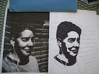
One of our first assignments in this section was to go home, go outside in the early afternoon (when the sun is at it's brightest), and take a picture of ourselves. We could then trace the picture and use a black magic marker or the Indian Ink we purchased with our supplies to shade in the shadows on the tracing. We were also given leave to utilize a computer's contrast capability to darken the shadows in the pictures even more to make tracing the shadows easier.

I ignorantly piped up to state: "But I don't have a Pen for the Ink." The instructor patiently pointed out I was to use the paint brushes we'd purchased with our supplies.
Oh.
{grin}

The point of this exercise was to begin to see that portraiture is all about shadows. A human being has no real angles - just shadows and soft curves.

I went home, took a variety of pictures,
{Yep, forgot to take out my earbuds.}
and explored how to change the photo to Sepia on the PC and tweak the contrast to bring up the shadows in the pictures.
I used magic marker to fill in the shadows on the tracings from these contrast pictures:

And I tried out the Indian Ink on one on the bottom left (and found I had much less control with the medium-sized brushes required for class).
{This exercise turned out to be useful in my Color and Composition class as well. Yep, that will be covered in a future blog.}

In the next class, he had us try to draw some "marble" busts - and I did alright (surprisingly).
My apologies - the in-class pictures are over-bright and my drawings {as usual} tend to be light. I did attempt to darken these a bit so I hope they're a bit more visible.
{As always, please click on the pictures to enlarge.}


We also did in-class, speed drawing where we drew sat across from a classmate, drew each other for 2 minutes, shifted seats, and drew the next classmate until we had met and had sketches of everyone. The instructor started us out with Graphite (pencil) and then had us try drawing with Conte crayons.
Not surprisingly, with my skill level, most of the portraits of my classmates are not, uh, complimentary, but my fellow students were all kind (some very much so) and it was fun to meet everyone and stare at them for a few minutes during the sketching. {grin}

A major assignment from the Portraiture section was to do a portrait of someone outside of class. I asked the DH if he would let me draw him. He agreed, but laughingly asked if it would be like a "Titanic sketch". {Uh, No.}

So a week or so before the portrait was due, I stalked the DH through a weekend to draw him.
But...he kept falling asleep!
He'd had a rough week sleep-wise and every time he sat down that weekend, he fell asleep.
Here he is "watching" ESPN. {grin *}
SO - I drew him asleep. {grin-er}
I can wholeheartedly confirm that my drawing was not the best of the portraits done for the class. I also believe my drawings were consistently not the least of the drawings done that semester.

But this is the only portrait I saw where the subject was asleep. ;-)

Portraiture shifted into Figure Drawing and a professional model joined our classroom for several weeks. We got to draw the human form with a variety of mediums (graphite, Conte, charcoal, ink) in a variety of time frames (15 seconds to 10 minutes).  I thought the model was very graceful, confident, strong, and extremely patient.

I have dozens of these drawings. Some days he had us sketch quickly for a few seconds, drop the paper to the floor and start on the next drawing. I've pulled out my favorites from the pile o'drawings to include here.
{As always, please click on the pictures to enlarge.}
 

This is probably my absolute favorite and might be the best representation of the model's grace:
{I think I might have done this one the
first day of Figure Drawing.}
Yep, Gryphon came by to help me take pictures of these Conte Drawings. 
 

And this was my favorite of the day he let us experiment some and I played with Charcoal:

All in all, Portraiture and Figure Drawing was a bit of an adventure and certainly something new for me. Drawing the model in class resembled my attempts to learn to speak Spanish - it takes me a while to remember the words I need and then longer to put them in the right order and conjugate the verb. I suspect I will never be "fluent" in drawing.

{*My sweet DH ok'd my including his portrait in this post - even though my drawing skills are not wondrous. He's a good guy and I'm pretty lucky to have him!} {And, no, he generally doesn't read my blog.} 

Tuesday, August 20, 2013

Mixed Media Knotting (aka Macrame)

Continuing the belated Spring 2013 Fiber Arts Degree posts:
The next "media" we covered in the Mixed Media class was "Knotting".
Also Known As: Macrame.

I don't actually remember my Mom doing Macrame. I do remember we had a bunch of Macrame plant-hangers-n-such 'round the house. And I remember when they got old they shed and eventually dropped the plant. {wry grin}

I'm embarrassed to say I was a bit leery when I realized the "Knotting" we were learning was that 70's-throwback craft: Macrame.

And - I really enjoyed it!

We practiced with random yarn the teacher pulled out for us...it took a while for the idea of which strand to cross over which way when going each direction to stick in my brain.
But I kind of liked how it worked.

The instructor then let us go though the mondo cabinets of yarn to pull colors for a small knotting project to practice upon. I found a novelty strand with navy blue, brown, and tufts of navy yarn stranded together and it became the inspiration for the other yarns I pulled - more brown, red, blues, and even MORE red. And I decided I realllly liked how it worked and how it knotted up.
{Can't miss the tufts coming off the "inspiration" yarn.}
The back of my brain reminded me that somewhere in the multitude of crafts-to-do awaiting my attention was a macrame kit of some sort. I tracked it down and tried the nifty Half Knot Twist stitch suggested for this bracelet:
The fiber was a bit slubby but the twisted stitch caught my fancy. 
As part of our assignment, we were told to add in, and subtract off some strands. So I decided to add in strands and incorporate the stitch I'd gotten from the kit into my small knotting practice piece:


The instructor correctly pointed out that the twist traveling across the front of the piece hid the color shift that was really pretty spiffy. So - I removed the twist and wove the stay ends in across the back.


I finished the small knotting project after I'd started the large knotting project. I believe I'd discussed the large knotting project with the instructor and we'd plotted a second, larger color-gradation companion piece to the small knotted project. So I guess both pieces became my large knotting project.
{I keep thinking there should be a third piece to round out the project but I'm not sure what color...}

Once again, we visited the mondo cabinets of yarn and once again I was inspired by one yarn for the entire project. It's hard to see in the picture below, but it's the slender, muted turquoise just off-center on the right. It was mis-placed in the wrong part of the cabinet and stood out. And it reminded me of water - the ocean. I then started seeking out more colors in that family and then I travelled to other shades and built another gradation of color.

The project didn't travel particularly well - pinned to the board as it was. And it had to be hidden away from Los Gatos. But I worked on it steadily and took the "Ocean" theme a little further, adding my nifty Half Knot Twist stitch to represent the waves rolling in.
 When I had it mostly knotted, the question of what to do with the ends arose. I played with it a while, considered clipping off the ends or weaving them in but I eventually decided...to leave them be.
Hmmm - looks like I forgot to take a picture focusing on the yarn tails.

 The topic of the tails also came up in class and the instructor presented the class with a variety of options:

  1. Hang vertically so yarn trails down toward the ground
  2. Remove the yarn tails
  3. And the way I had plotted it - horizontal, darkest yarn at the top and tails on the left hand side. 

The vote was that the tails should stay but I found it rather fascinating and nifty that not everyone visualized the ocean and waves the same way I had.
{Ok, some folks didn't get the ocean vibe at all.} ;-)
The interpretation from one of my table mates is my favorite and delights me. She saw it depth-wise. She saw the white as the top of the ocean and the colors (water) darkened as you go "downward" with the ocean depth. Cool, huh?

I'll say it again: I truly enjoyed my limited sojourn into Knotting (Macrame) and I keep thinking about that 3rd companion piece to the two shown above. We'll see if I get back to that.
But I did do a little more knotting - for use in my final Mixed Media project.
I used it in a way that I don't think is usual for Macrame.
{And I'm pretty darn tickled with the results - but that is fodder for another post.}


Sunday, August 18, 2013

Summer Session is over & I now have a grudging respect for...

{sigh}
I finished the 5-week, accelerated Art History II course.
{whew}
And...I got straight "A"s.
{Yay!!}
And, I'd like confirm that spell-check is way better than sliced bread.
{Really - my sincere thanks to the person that came up with spell-check!}
And the teacher was complimentary of my writing.
{proud grin}

AND...although I got extremely frustrated, a bit whiny, and I made several, um, well, derisive "Really?!?" comments at my PC as we went through the latter part of the 19th century and into the art of the 20th century... I learned a lot and I did actually enjoy the experience.

But I'm having guilt about my general lack of delight (and slightly rude comments) for Impressionism, Post-Impressionism, Symbolism, Fauvism, Expressionism, Cubism, Futurism, Dadaism, Surrealism, Abstract Expressionism, and Post-Modernism art. (And, yes, I am skipping some "isms" in the last few centuries, but they boggled me too.)
(The nice folks over @QuizMeArtHist on Twitter are probably un-following me with extreme prejudice even as I type this...) I'm kinda wondering what is wrong with me that I would look back over the centuries, at all this worthy, famous, expensive and acclaimed art and my response to some of it was: "Really?!?".

Ok - a lot of the art from the above art periods still do not thrill me - However - I do have a much greater appreciation for the art in those periods. Even if it is a piece of art that I don't want to see every day, hang on the walls in my home, or use as wallpaper on my PC, I can still appreciate the time, effort, thought, and personal investment the artist put into their art. So I am endeavoring to apply acceptance and appreciation to the psychological, philosophical, theoretical science, and good old-fashioned Rebellion that was the core inspiration for some of these art periods.

(Any clever or educated comments that follow can be directly attributed to my Art History II Instructor.)  {Who has space available in her upcoming Fall semester classes. ;-)  }
(Any "duh"-ish comments that follow would be all me.)

Impressionism:
Whilst I am not fond with the sketch-like quality of Impressionism, such as Claude Monet's Sunrise, I am impressed with his interpretation of light and dedication to recording light on the same subject on different days/weather - such as the 20 views he did of the Rouen Cathedral.

Post-Impressionism:
Post-Impressionism refers to the period when Vincent van Gogh, Paul Gauguin, Georges Seurat and Paul Cezanne were painting. The post-impressions were still about color, real-life, brushstrokes and thick paint but also about more depth - emotion, symbolism, religion, etc.

I must confess, van Gogh is growing on me - although some of it is the influence of the charming 2010? episode of Doctor Who: "Vincent and the Doctor"(truly stellar cast!).
We studied Night Cafe in class and that helped to explain/demonstrate the emotion van Gogh was trying to portray. I hadn't realized that we had records of his artistic intent in the numerous letters he wrote to his brother, Theodore. For some reason, it makes me feel better to know he was not entirely alone.
I am more partial to some of his other works:Wheat Field with Cypresses - The Starry Night - Irises.

Gauguin and Cezanne - for me - they fall under the category of general appreciation of the time, effort, and thought.

Now Seurat - I rather like Pointillism/Divisionism. I suspect it appeals to the aspect of my personality that revels in detail. I was introduced to Seurat in the drawing class I took earlier this year but we studied A Sunday on La Grande Jatte in Art History II.
{By the Way - I tripped over this Artrageous show on Seurat & Pointillism - it is angled toward kids but it's quite spiffy and does an excellent job of explaining Pointillism. Worth sharing!}

Symbolism
Although I'm not particularly fond of The Scream (any of them & there are actually quite a few anxiety-ridden versions {did you ever wonder if the "Home Alone" series was inspired by that painting?}), I found some parts of imagination-based Symbolism rather appealing, such as the detail in Gustave Moreau's art, classic Gustav Klimt, and Henri Rousseau's "naive" (lack of academic training) art.

Arts-n-Crafts-n-Nouveau
The example of the Arts and Crafts period was more fussy than I expected (William Morris, Green Dining Room) but I love the premise of functional, high-quality works of craftsmanship based on a premise of natural form and pattern. The Arts and Crafts period led to Art Nouveau - of which I'm rather in love with but more on that in another blog.

Fauvism, Expressionism, & Cubism
Fauvism and Expressionism are pretty similar in my mind and introduces the art reign of Henri Matisse (Harmony in Red) and Andre Derain, Ernst Kirchner (Street, Dresden) and Emil Nolde.
Art continued to evolve to be more about the feelings or idea and less about the subject. Bold colors were used to express emotions, although the German Expressionists used darker colors and more ragged/harsher line.
Another group of German Expressionists were less primitive: Franz Marc's art is striking, but he seems to have lost hope based on "Fate of the Animals". I did find Impressions 28 (Second Version) by the literally brilliant Wassily Kandinsky appealing. It could be the color scheme or perhaps his theory is correct; that art doesn't need an object/subject and that color and form would speak to the viewer.

Cubism is famous for Pablo Picasso (Les Demoiselles d'Avignon) and Georges Braque (I'm a bit more fond of Braque's art.)
The instructor presented the concept of cubism several ways. My first interpretation was: It is an attempt to paint something that is 3-Dimensional in 2-Dimensions but representing all 3 dimensions - which doesn't work so well when explaining cubism in sculpture. So a further interpretation was: a touch of abstract and presenting parts of the object - broken up into pieces/seen from many views (i.e. take a step to the right and build that view into the art). Interesting.
But I have to confess, for me, it's kind of like looking at someone's baby ultrasound and puzzling out where the baby is in the picture.

Futurism
I found the Futurism guys to be a bit scary. Although some of their art was visually appealing, the Futurists felt war was an excellent, romantic, cleanser of all things - old art, old beliefs, literature, etc. Ironically, several Futurist artists died when they actaully got to experience war first hand in World War I.

Dadaism
The Dada group were the anti-art group. They didn't explain their art, reveled in change, random chance, nonsense, cynicism, standards of art, and they actively pursued irrationality and being the opposite of...well, anything. I have to admire their efforts to be so very different, their sense of humor (I hope), and their self-confidence. (Here's a link to a nifty NPR article.)
Classic Dada: Fountain - part of the "Readymade" art of Marcel Duchamp who stated his Readymades were "Based in a reaction of visual indifference with a total absence of good or bad taste". He submitted this piece to the Society of Independent Artists in New York in 1917(?), testing how independent (open-minded) they really were. It was rejected (and yes, the "Fountain" is what you think it is).

Surrealism
Salvador Dali = Surrealism - in spades.
However, I thought Rene Magritte's The Treachery of Images niftily satirical. (Translation of French on the painting: "This is not a pipe." (You've probably seen other examples of his works too.) And although Meret Oppenheimer's surreal Object (Le Dejeuner en fourrure/"Luncheon in Fur") tickles my gag-reflex some, it is clever.


Abstract Expressionism and Post-Modernism art
This post has gone on nearly toooooo long. So I'll finish up with just a couple of the more modern artists we covered.

I didn't know that Abstract Expressionists like Jackson Pollock cut portions out of a larger work or that Helen Frankenthaler made several versions to achieve the spontaneous or tranquil effects in their work.

I also had to revise my opinion of Andy Warhol. I didn't know he was originally an award-winning illustrator and that no two bottles are exactly the same in Green Coca-Cola Bottles.

Yep, enough blogging for today. It actually took me a few days to write this and find all the links. That effort resembled (even down to a few rude comments) my Art History II Journey on the above art periods. Sometimes it takes a while to embrace acceptance of the uncomfortable - art or otherwise.

Here's a little bit of knitterly content found during my Andy Warhol search for links. Seems the Warhol Bridge was recently Yarn Bombed!


Particular thanks are offered to the many stellar museums and educational facilities that present images and educational material on the Internet so that we can learn from afar and so I can link to trustworthy, knowledgeable, and interesting experts.  
The J. Paul Getty Museum, The Metropolitan Museum of Art, Musee Marmottan, The Van Gogh Museum, Yale University Art Gallery, The Museum of Modern Art, National Galleries Scotland, The Philadelphia Museum of Art, Belvedere Palace & Museum, The National Gallery London, The Athenaeum, The Whitney Museum of American Art, and The State Hermitage Museum of Russia.
(Sincere, humble apologies are offered if I missed thanking any of the amazing folks whose websites I linked to in this post.)